
Visualize the Senses (p.1)
The Weird Art and Minds of Music Obsessives

I’ve spent the past few years thinking about this special connection I have with album artworks. Many times I’ll listen to a record in a store without even knowing the artist or reading any info, letting the cover make the choice instead. That approach has become a way for me to be surprised, but also to remember music more easily. My brain can’t handle too much information all the time on track titles, and living in this digital age can be difficult to process - but if you show me the cover, I could probably hum the track (hopefully not out loud).
As a co-founder of Siamese Twins Records, our way of connecting music and art has always been at the forefront of what we do and has remained consistent since day one. Those two worlds go hand in hand for us, and much credit goes to my label partner and artist, Taychin Dunnvatanachit, a wizard of his craft who has inspired me a lot to look further and seek other labels that follow the same mantra.

While taste is subjective and everyone has their own, for me it’s everything, and first impressions always last. Maybe that’s why I’m a little picky. But it’s simple: if you’re going to invest so much into making a physical record, why hold back on the artwork? It’s a chance to go all out and create something that feels strong, and unique. Maybe I got lucky to share a creative collaboration with such an artist, but for those who are still seeking, there are so many out there worth exploring or building a story with.
Back to the topic at hand, let’s talk about a pairing that feels perfectly made for each other in some fourth world psychedelic dimension. Astral Industries, a fantastic record label from the UK, has been collaborating with illustrator Theo Ellsworth since their debut release. If you’re not familiar with either, you’re about to have your mind blown. Totally out of the box, and if you look closely, you might find little details that reflect a world mirroring both our inner and outer lives.
Do you see?…
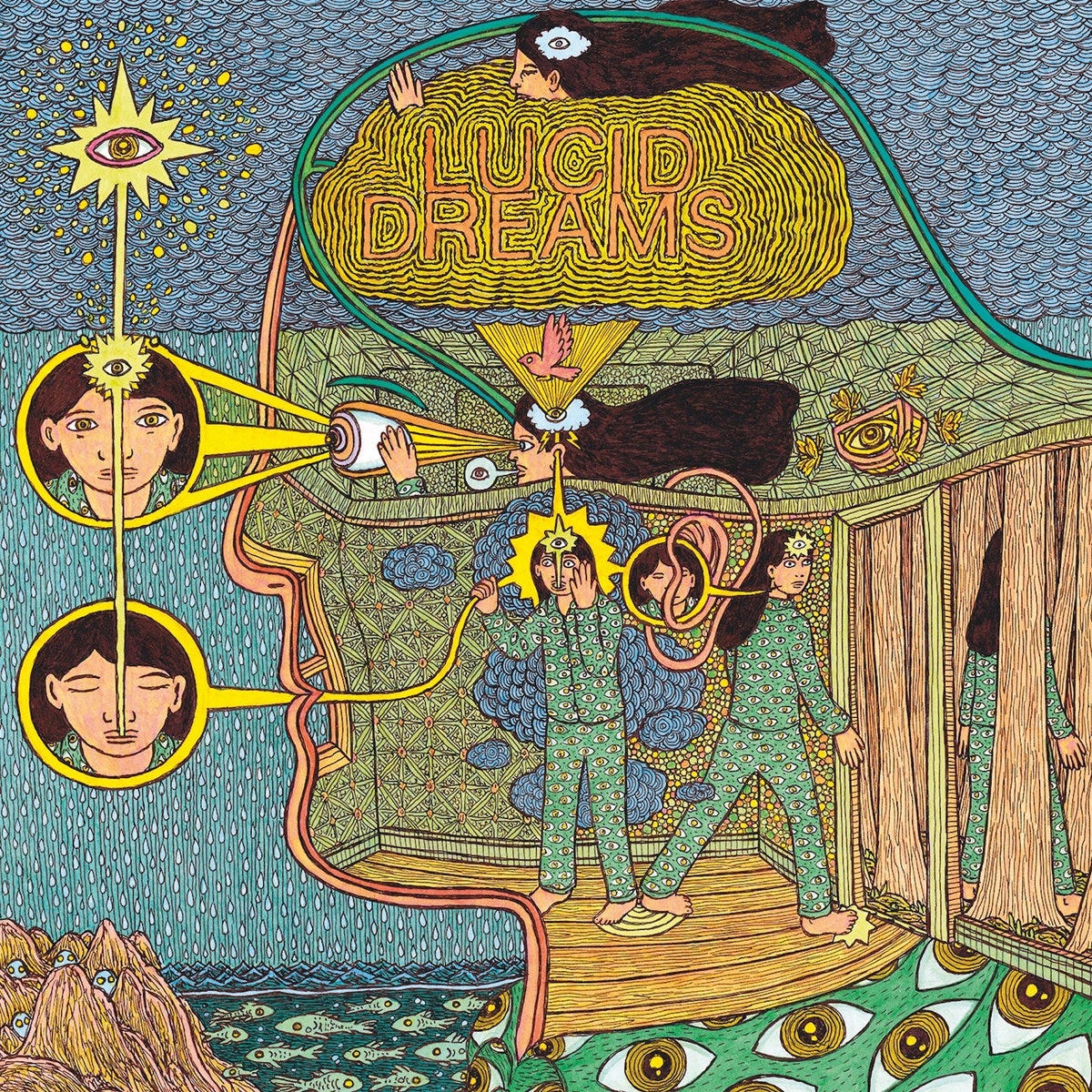
Pablo Picasso, describing the creative act of painting, once reflected that “It’s not an aesthetic process; it’s a form of magic that interposes itself between us and the hostile universe, a means of seizing power by imposing a form on our terrors as well as our desires.”
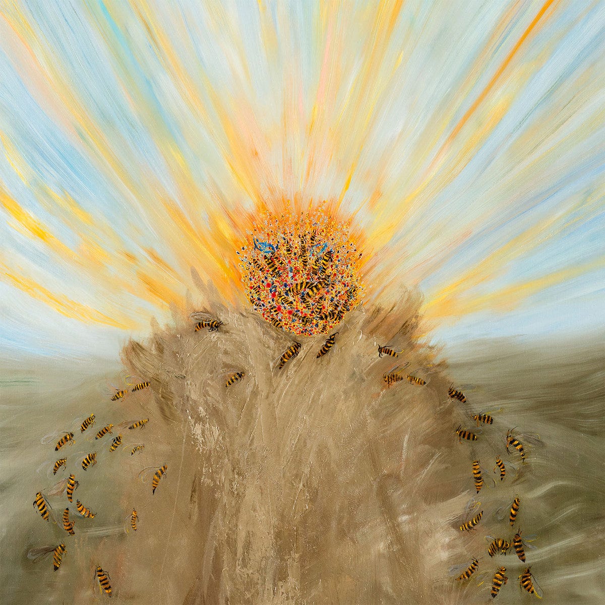
Keeping in spirit with the fourth world, One from the album on AD 93 called “The Tumbling Psychic Joy of Now” by Shackleton. I remember finding this at a store in Barcelona last year and not even thinking twice before copping it. The artist here is Elina Merenmies, who has been active since the 90s. Her connection with Orthodox faith deeply shapes her life and art, reflected through her daily rituals, her painting, and the rich mix of religious and art historical references drawn from years spent exploring Europe’s cultural heritage.
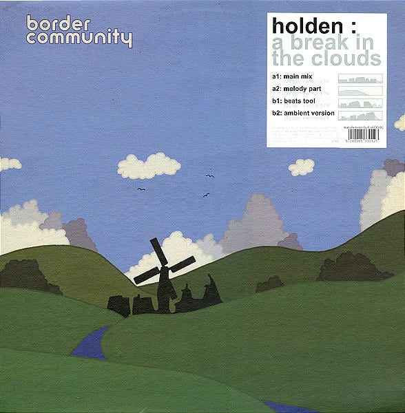
Even if we move back in time to the mid 2000s, labels like Border Community had those recurring countryside landscapes, windmills, and pastel skies that became almost a signature of the label’s aesthetic. They were art directed by label founder James Holden together with Tom Horner, who illustrated and designed much of the label’s early catalogue.
It’s a perfect example of how a label can build a particular mood and memory not just through sound, but through visual identity as well. It’s a piece of history for anyone collecting those records..
Another great impression is that many record labels also use real-life imagery, which I find interesting because a photographer’s visualization can often feel like a musician’s composition. A core memory, really.
More to share, and that shall continue again in the future..